LottieFiles Web & Marketing
Evolved LottieFiles’ web presence into a more mature, cohesive experience for discovering and engaging with animation
- Responsibility
- Design and visual direction
- Area
- Web & Marketing
- Partners
- Brand, Product, Marketing
Impact
Made animation discovery and navigation clearer across LottieFiles, helping users find and engage with animations across the site.
- +316%
- monthly search volume
- +35%
- monthly file views
I led the design and visual direction for LottieFiles’ web presence, helping shape the wider evolution of the brand and raise the standard for design, visuals, and animation across both marketing and product experiences.
Alongside this, I reworked how users discover and navigate animation across the site. I redesigned the browsing, search, and animation detail experiences to make animations easier to find, improve navigation between results and individual assets, and keep the focus on the animation and its key actions.
I started with the homepage, animation pages, and tools pages, then worked on the Lottie Creator landing page. Across these projects, I shaped the information architecture, UX, UI, interaction design, motion, and reusable structural patterns behind the new visual language.
Once the direction was established, I guided its rollout across the wider marketing site. I worked with other designers as existing pages were migrated and new ones were created, providing guidance to keep the work consistent with the new visual language and system. I led stakeholder reviews, ran regular design reviews, conducted design QA, and gave final design approval before release.
Why it mattered
As LottieFiles grew, its web presence needed a more mature and cohesive visual direction, while making it easier for users to discover and engage with animation across the site.
Key decision
Created a shared visual direction and flexible structural, interaction, and motion patterns that could be extended consistently across the site.
Outcome
The new direction created a more cohesive web experience, while stronger review, approval, and QA processes helped maintain consistency and quality as the work expanded.
Set the visual tone and introduced the core product story
Modernized animation browsing, search, and discovery
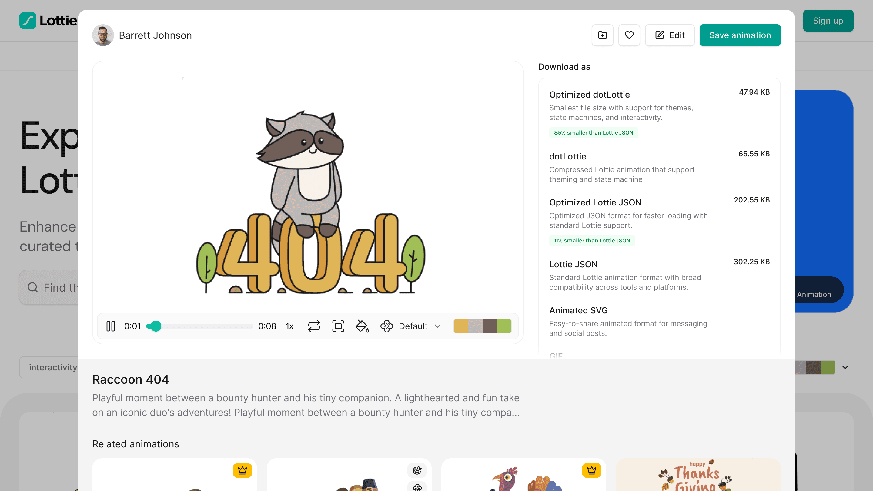
Focused animation details on the asset and its key actions
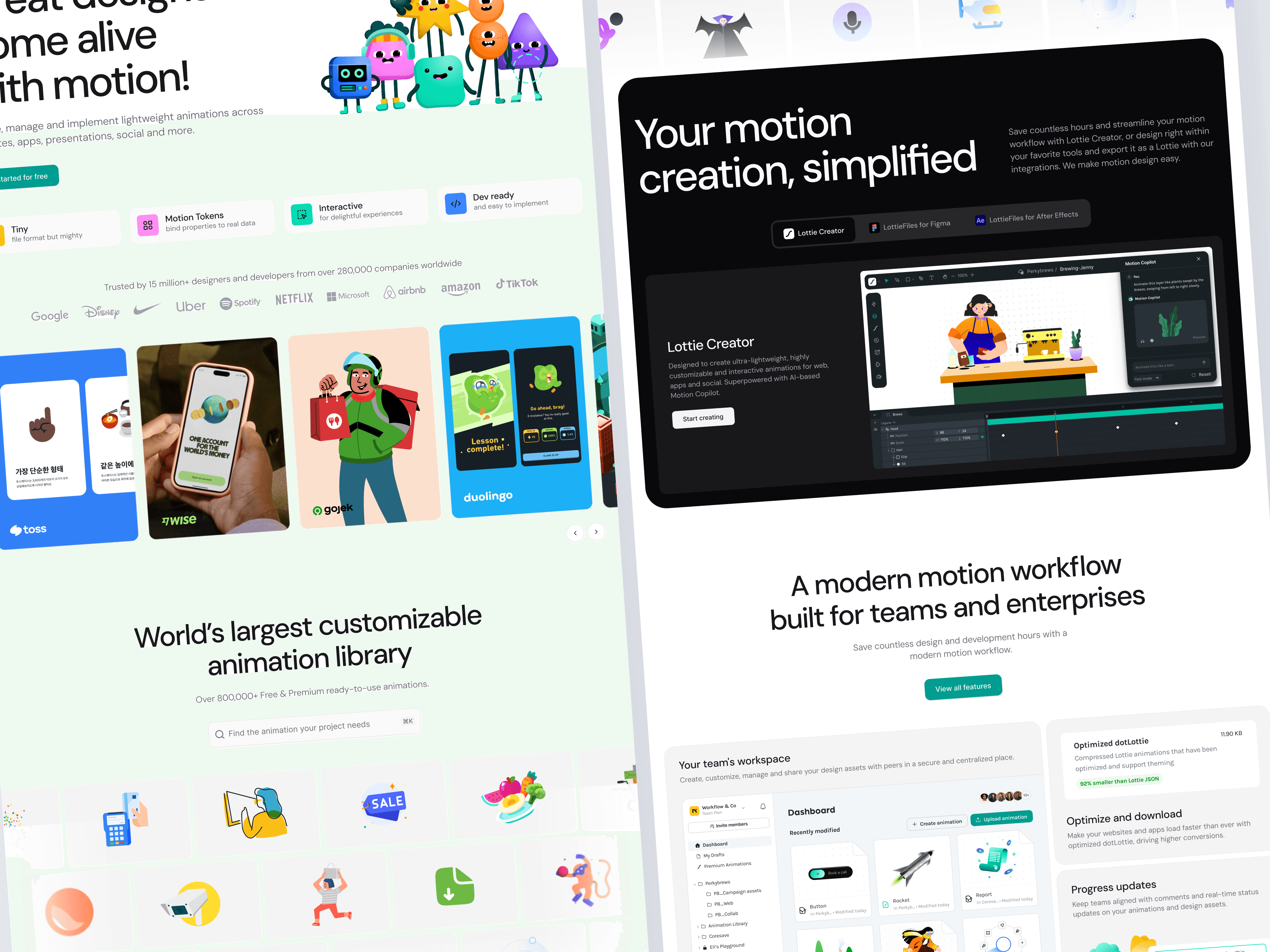
Homepage connected discovery, creation, and team workflows
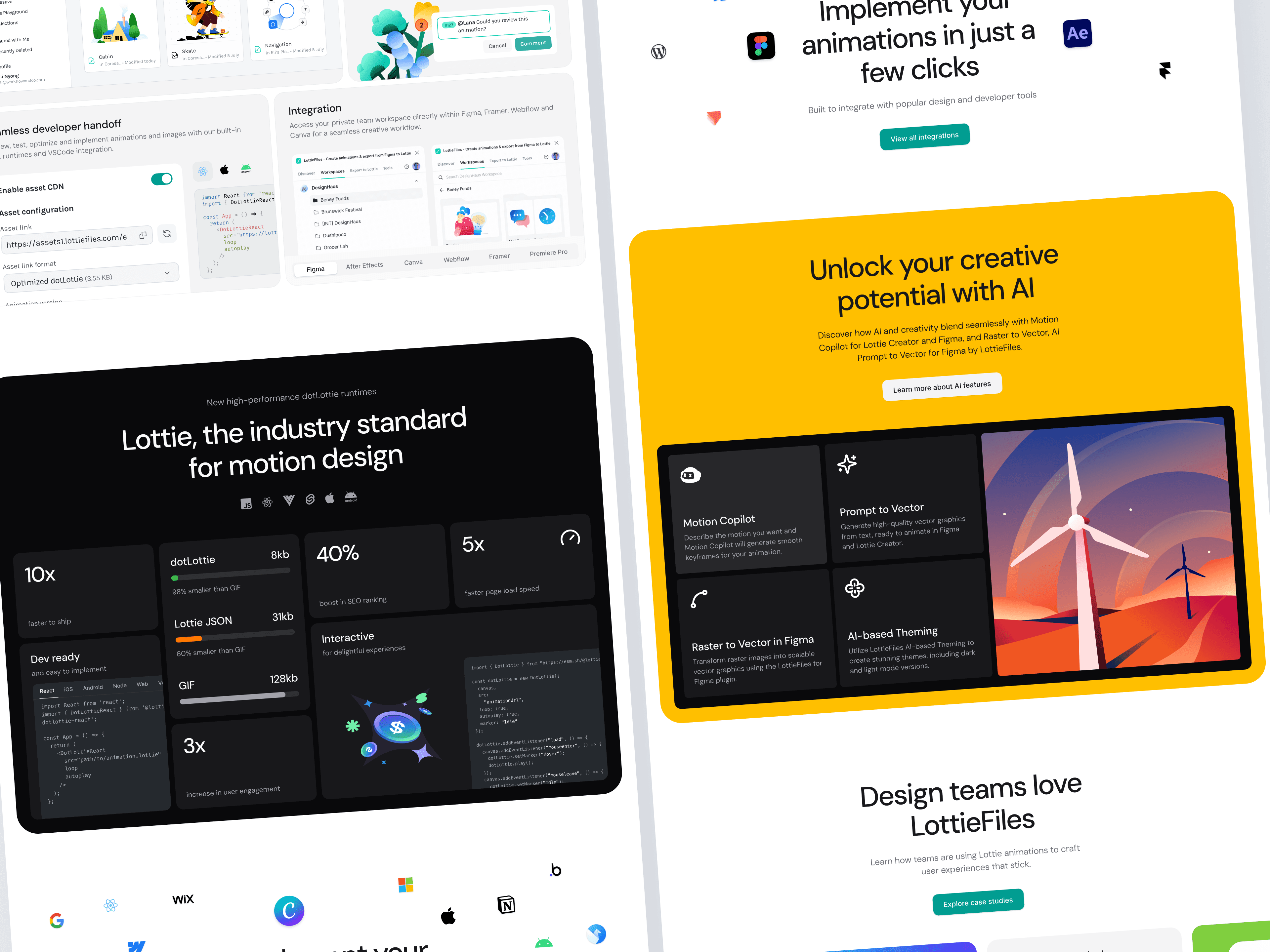
Then carried the story through product capabilities, performance, and customer proof
What scaled
The visual language, structural patterns, interaction principles, and approach to motion became a shared foundation for new and migrated pages, allowing other designers to extend the work consistently.
“Niklas impact spans from redesigning our highest-traffic landing pages, including the core Homepage to driving a major brand evolution that overhauled our design system across typography, color palettes, and asset architecture.
Niklas operates as a true Staff-level leader, seamlessly bridging the gap between design and engineering to optimize cross-functional workflows. He is easily one of the best Product Designers I have ever collaborated with.”
Celcea TifaniBrand Manager & Designer
“Niklas is a product designer who combines strong design craft, strategic thinking, and the ability to bring people together around a vision.
A great example of this was the LottieFiles marketing website redesign, where he was the primary product designer driving the work. He collaborated with visual designers, brand, motion designers, marketing, and stakeholders to shape a cleaner and more modern experience.”
Inad HussainDesign Lead at LottieFiles
“Niklas is one of those rare designers who raises the bar without making it a thing. He helped drive the design direction of a product millions of designers rely on, and he did it with taste, speed, and zero ego.
He’s also just a joy to work with. Super friendly, gets it immediately. Any team would be lucky to have him.”
Nattu AdnanCo-founder & CTO at LottieFiles
Showing testimonial 1 of 3